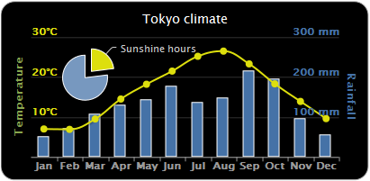
Do you need to plot charts in your django websites? Are you using boring static chart images and do you like your charts to be more interactive and interesting? Do you have to write a lot just to convert the data to the right format before you can plot?
Introducing Django Chartit – an app that lets you render interactive charts and graphs easily using your models. Chartit can plot line, column, area charts, scatter plots, pivot charts and much more! Chartit charts are rendered by HighCharts and jQuery Javascript libraries, producing highly interactive images.

Chartit works by converting your data to JSON along with all the necessary options for HighCharts to render charts and graphs.
Allow me to demonstrate how easy it is…
Installation:
Of course, let’s begin with the installation. Chartit can be downloaded from github or you can pip install django-chartit
Chartit has dependencies on the following Javascript libraries:
Download these libraries and place them in your static/media folder; otherwise, you won’t see any graphs.
How to use:
Step 1 – Create view
Register chartit in your INSTALLED_APPS. Assuming you have your models set, create the view that will render the page with your chart. In that view, instantiate DataPool and Chart objects.
def line(request):
    ds = DataPool(
       series=
        [{'options': {
            'source': MonthlyWeatherByCity.objects.all()},
          'terms': [
            'month',
            'houston_temp',
            'boston_temp']}
         ])

    cht = Chart(
            datasource = ds,
            series_options =
              [{'options':{
                  'type': 'line',
                  'stacking': False},
                'terms':{
                  'month': [
                    'boston_temp',
                    'houston_temp']
                  }}],
            chart_options =
              {'title': {
                   'text': 'Weather Data of Boston and Houston'},
               'xAxis': {
                    'title': {
                       'text': 'Month number'}}})

    return render_to_response('chartit/chart.html', {'weatherchart':cht})
In this view, we’ve created a DataPool object and have set its source. Here, our source is a model MonthlyWeatherByCity that has month, boston_temp, and houston_temp attributes. We’ve also instantiated a Chart object which contains our chart properties/options and the DataPool object as our chart datasource. In this example (which, by the way, is taken from Chartit’s official demo page), we specified our chart type as ‘type’: ‘line’ so the resulting chart would that be of a line. For a list of options you can specify to customize your chart, go to Chartit’s and HighChart’s API references.
Step 2 – Create template
Your template must contain a javascript link to your jQuery and HighCharts libraries. Load the chartit template tags and use load_charts to convert your objects to JSON. load_charts takes one argument – a string containing all IDs of containers (separated by comma) you want to put your charts into. It returns all your data and options in JSON format which HighCharts uses to render SVG or VML images.
<html>
 <head>
 <script type=”text/javascript” src=”/media/js/jquery-1.7.1.js”></script>
 <script type=”text/javascript” src=”/media/js/Highcharts-2.1.9/js/highcharts.js”></script>


 </head>
 <body>
 <div id=”container”>
 </dv>
 </body>
 </html>
Voila! Your Django project now renders beautiful, interactive charts without much coding.