At Bixly we have a great set of talent in UI/UX, not least of whom is Nick Wortley, founder and partner of Bixly. Combined with our team of design experts, we really have a depth of knowledge that we can apply on a wide variety of projects. Despite this, our best UX experts were the actual end-users of the Overflow app.
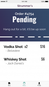
From the outside, the life cycle of ordering a drink seems stupidly obvious, but if you haven’t worked at a bar (and apart from one developer on our team, we hadn’t) you may not know the pitfalls, the sticky points, the frustrations, or the areas where your next great app idea actually makes the process worse. Knowing that we would inevitably have blind spots, we took our idea to a few bar managers and bartenders before writing a single line of code. We spent a week or two developing full-color mockups of how we thought the app would work, presented it to these real users, and took their feedback seriously.

As an example, one of the most unexpected results of testing our solution in the wild was observing how we had to design our iPad app differently than any other we had made before. Why? What was the difference? Most users interact with an iPad that’s sitting in their lap or in their non-dominant hand. From that perspective, most apps naturally compensate from where the user thinks their tapping versus where they are actually tapping on the glass. The same thing goes for your smartphone and, say, the keyboard interface. For anyone who remembers, the first time typing on of those screens was reaaally frustrating. You had to tap directly on the letter from an almost top-down, pinpoint accuracy.
But with Overflow, the user interacts with an iPad that is set on a stand, not in their lap or in the crook of their arm. This means the angle at which they approach the touchscreen is different. This means how they expect to navigate the app is different. Taking the time to closely observe the way users actually interacted with the app in the wild allowed us to adjust the app to be more seamless and comfortable for the end-user.
A lot of software development is slowly shoring up those holes of ignorance. It’s true: you don’t know what you don’t know. Going in with the knowledge that there’s going to be blind spots really helps uncover them more quickly so we can get to the real work of providing useful solutions.